
Sunday, January 31, 2010


Saturday, January 30, 2010
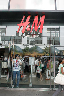
H&M - Website
 The first site you get to www.hm.com has you choose which county you are from. By clicking on the United States, I was redirected to www.hm.com/us. There is no online shopping available for the US, however they do have links for employment, investor relations, press, corporate responsibility, and a write up about their company.
To make up for not having online shopping available, they do have a fashion guide which allows you to browse through a few examples of their line for this season. There are also videos corresponding to the season’s line.
The main focus on H&M’s current site is their line by Sonia Rykiel. There are only 4 outfits displayed online, however in small print along the bottom of the site it does say that the full line will be available for viewing on hm.com Feb 9th.
Interestingly, just like in their stores, alongside the pictures of the models and clothing there are big, bold prices.
 H&M has a style magazine that is also available for viewing online.
Apart from the home page, which has a slight gradient, the site is white with black sans serif for the navigation bar and occasional red highlighting of text to match the logo. However, for some reason, there was one section that changed color. Drastically. And only that one section did. Under Fashion- Top 5 the women’s page turns a deep rusty orange, which causes the navigation bar to be much less readable. It also changes the recognizable red logo white. For the men’s top 5 there is some shadowy image in the background, all tan and brown. The logo now turns black, and parts of the navigation bar fade to a grey. It’s all very bad.
For the majority of the site large display type is in Trade Gothic Bold. Body copy is in Arial, and headings are in Helvetica Bold.
*** I signed up for their email, but so far only received the conformation which was just one sentence, no images, nothing that would draw me into their store immediately. I have to wait for their next newsletter to come out.
The Gap - Website

Home page of the website, the main focus is on ‘military khakis’ headlined in a rusty orange Garage Gothic black. Like the store, the site is very stark and clean- white, white, white, with boxes around everything. Little touches of color appear in the dark blue taken from the GAP logo, orange, red, and grey.
All of the type is sans serif. The majority is in a lightweight grey Arial, adding to the sterile feel of the site. For the headlines they use all caps. Lowercase letters are used only in descriptions and the navigation bar.
The drop down menu for the navigation bar appears in all lowercase letters, which is odd since in no other area of the site does this happen. One drop down menu appears in small caps, breaking the structure even more.
Navigation at the very top of the site allows you to switch between different stores, each name appearing next to their logo. One of those companies, Piperlime, has a lime as its logo. Any link related to Piperlime on Gap’s website is presented in the same color as the lime logo, making it easy to associate the two.
Overall the site is clean and easy to find my way around, which is extremely necessary considering the wide range of technical skills one would find throughout their client base.
***Oh and I signed up for their email. It is set up to look JUST LIKE the website.
Friday, January 29, 2010


Tuesday, January 26, 2010


Subscribe to:
Posts (Atom)